hidden
-

Success
You have reached my
Portfolio
Jump to a section or keep scrolling
Jump to a section or keep scrolling
I am a UX enthusiast, a research fanatic, a communicator and a collaborator.
After over a decade of working in the graphic design industry, I now focus on user experience and user research. With a background in Psychology and an MSc in Human-Computer Interaction, I bring together my experience in design with my curiosity about people, their behaviour and the experiences we create for them.
What draws me most to UX is the opportunity to ask questions, understand why people behave the way they do and turn those insights into better experiences. I genuinely believe that with empathy, we can not only create usable, equitable and enjoyable products but also make a change in the world.
You can find more about my experience, education and professional background on LinkedIn by clicking my name in the top-left corner or, more conveniently, by clicking here.
If you like what you see on this page, let’s connect on LinkedIn. If you need to contact me right away, feel free to do so!
Continue
Nutrition calculators are currently less prevalent in the market, creating an opportunity for restaurants to stand out by providing accessible nutritional information about their dishes. Designed for a modern restaurant, the app responds to growing health-conscious trends and aims to enhance customer satisfaction while positively influencing the restaurant's brand image.
Restaurant-goers with dietary requirements need information about restaurant dishes that is easy to access and understand.
Design a nutrition calculator app that allows users to view the nutritional values of individual dishes and calculate the cumulative nutritional values of selected items.
Conducting interviews, preparing surveys, creating paper and digital wireframes, developing low and high-fidelity prototypes, conducting usability studies, considering accessibility and iterating on designs.
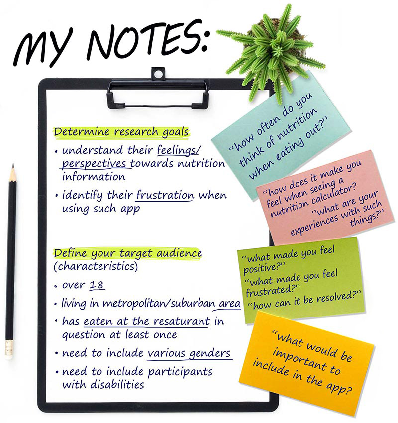
I conducted interviews and created empathy maps to better understand restaurant-goers and their needs. Through this research, I identified two main groups: customers who are health-conscious by choice and follow a particular diet, and those whose dietary requirements are related to an illness, allergy or intolerance. The research confirmed some of my initial assumptions but also revealed that not knowing the nutritional values of restaurant dishes was only one of the challenges faced by people with dietary requirements. Other difficulties included finding restaurants that provide nutritional information and the frustration of needing assistance to identify dishes that meet their dietary needs while dining out.
Using empathy maps to understand what users think, say, do and feel, I identified the following pain points:

Limited Availability
Restaurant-goers in Dublin have difficulty finding restaurants that provide nutritional information through their apps.

Information Architecture
Text-heavy nutritional information can be difficult to read and understand. Poorly structured information can make it harder for users to find and interpret what they need.

Limited Functionality
The lack of cumulative calculations and complicated search functions can frustrate users and create a negative experience.

Accessibility
Limited accessibility features can make nutritional information more difficult to access for users who rely on assistive technologies.
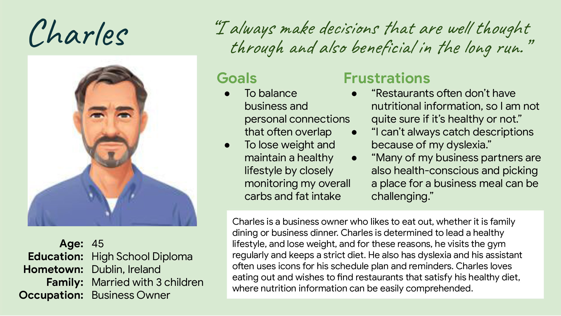
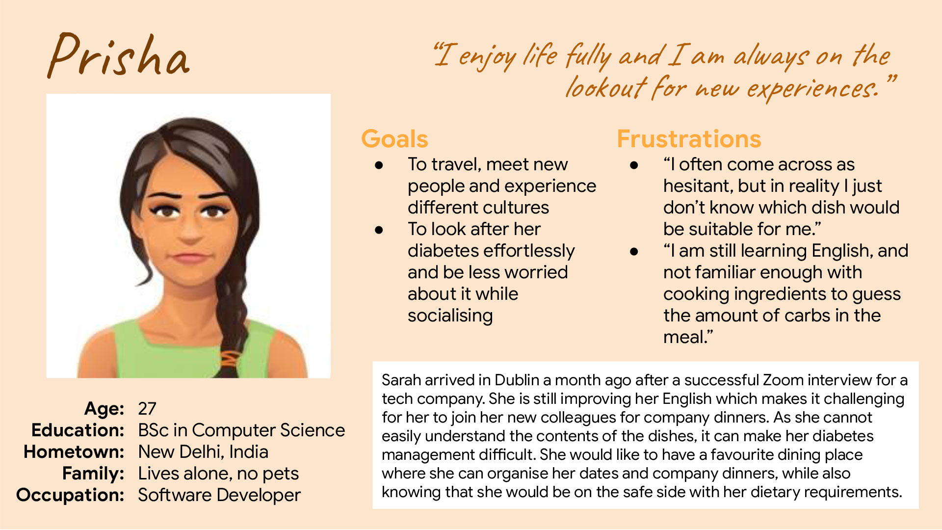
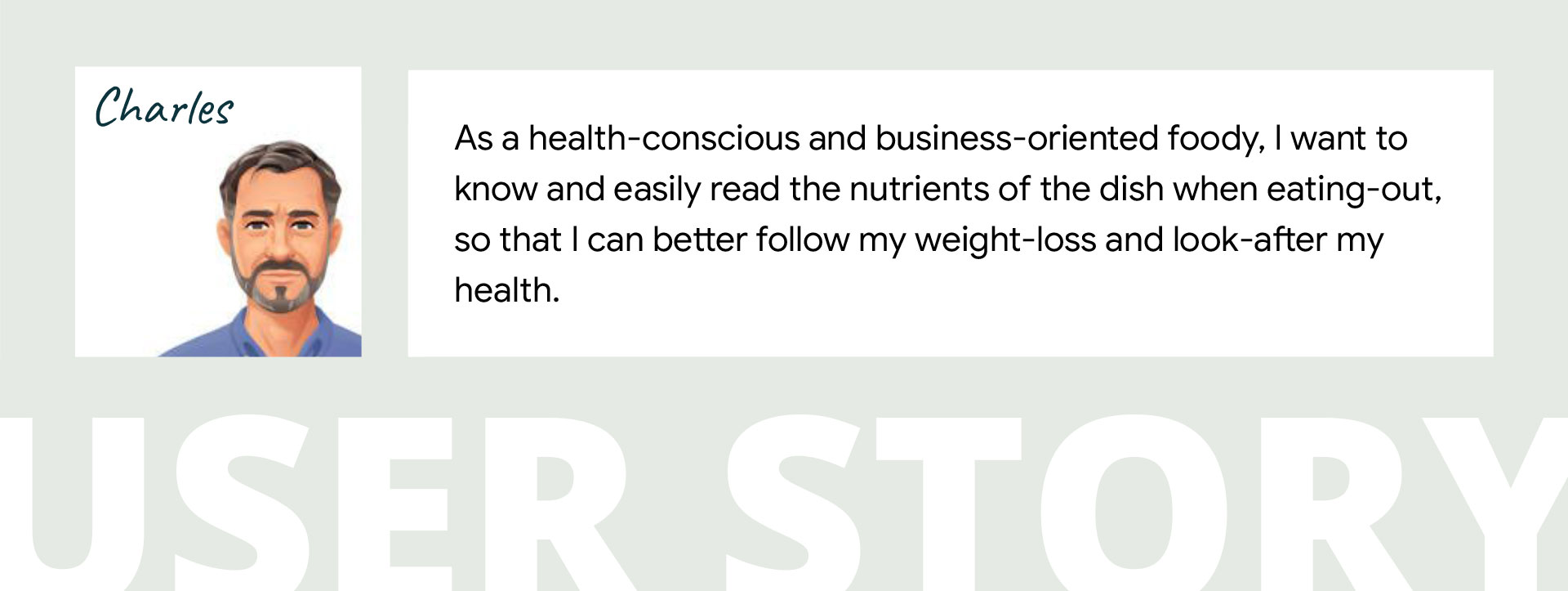
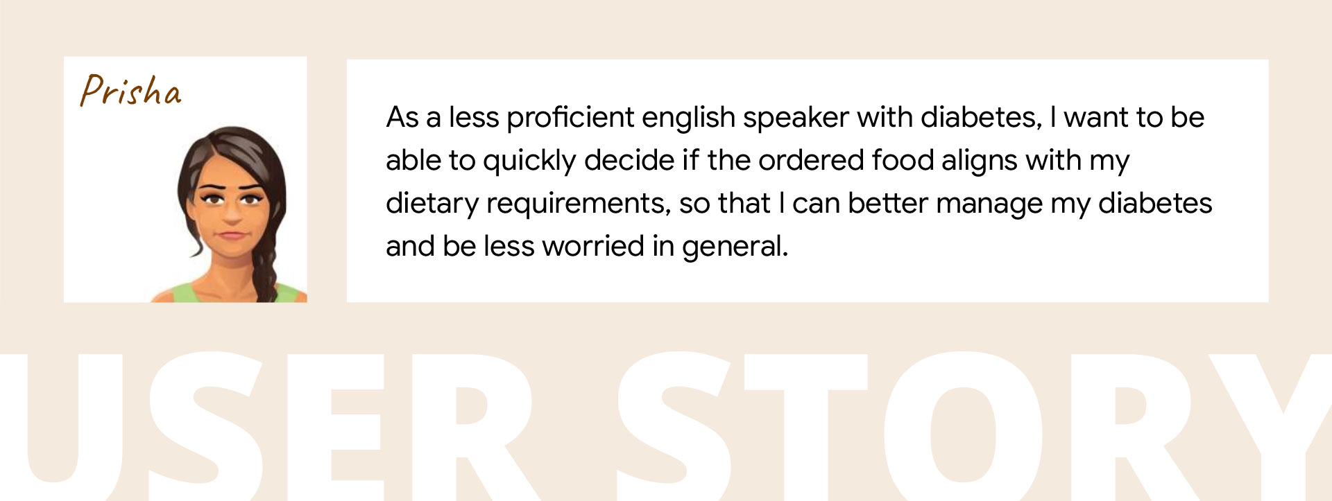
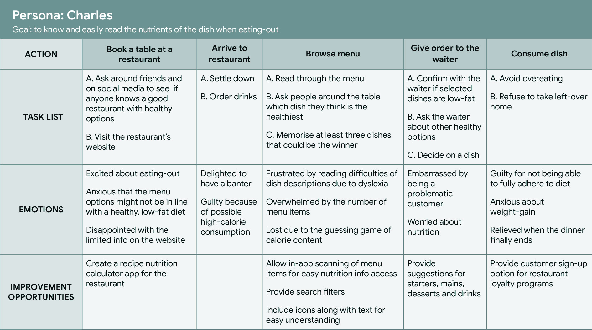
User journey maps, built around the personas and their stories, helped me better understand the experience from the users' perspective.
For example, mapping
Charles' journey highlighted the value of an easy-to-understand nutrition calculator with simple search, filtering and suggestion features.
Charles is a health-conscious adult who needs a quick way to assess the nutritional value of his meal because he wants to manage his calorie intake and stay on track with his diet.
Prisha is an adult with diabetes who needs an easy way to identify suitable meals because she wants to make informed choices while managing her dietary needs.
Together, these problem statements highlighted the need for a solution that supports both preference-based and health-related dietary requirements while making nutritional information quick and easy to understand.
The app provides easy-to-understand nutritional information for individual dishes and combinations of dishes, with filtering and suggestions to help users find options that meet their specific dietary requirements.
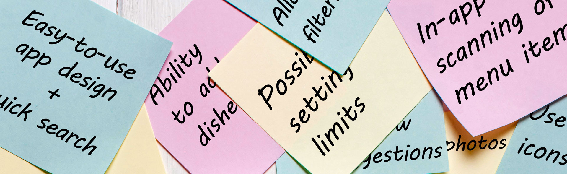
After conducting a Competitive Audit (click here to view) and summarising the findings in a Competitive Audit Report (click here to view), I identified gaps, potential solutions and opportunities. Ideation then took off with the "How Might We" exercise, based on the problem statements, followed by Crazy Eights to quickly generate and compare different design ideas. I then created a goal statement to define the scope and purpose of the design. The statement outlined that the Nutrition Calculator app would provide health-conscious users and those with dietary restrictions with nutritional information about individual dishes, as well as cumulative nutritional information for multiple selected dishes. The effectiveness and usability of the design would be evaluated through task completion time, user error rates and user feedback.
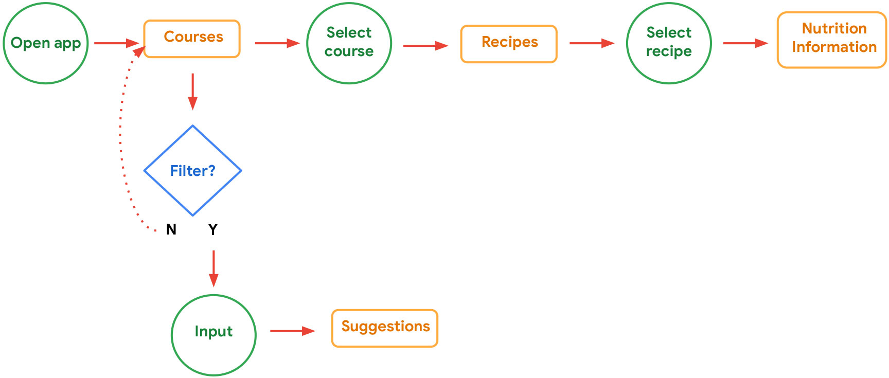
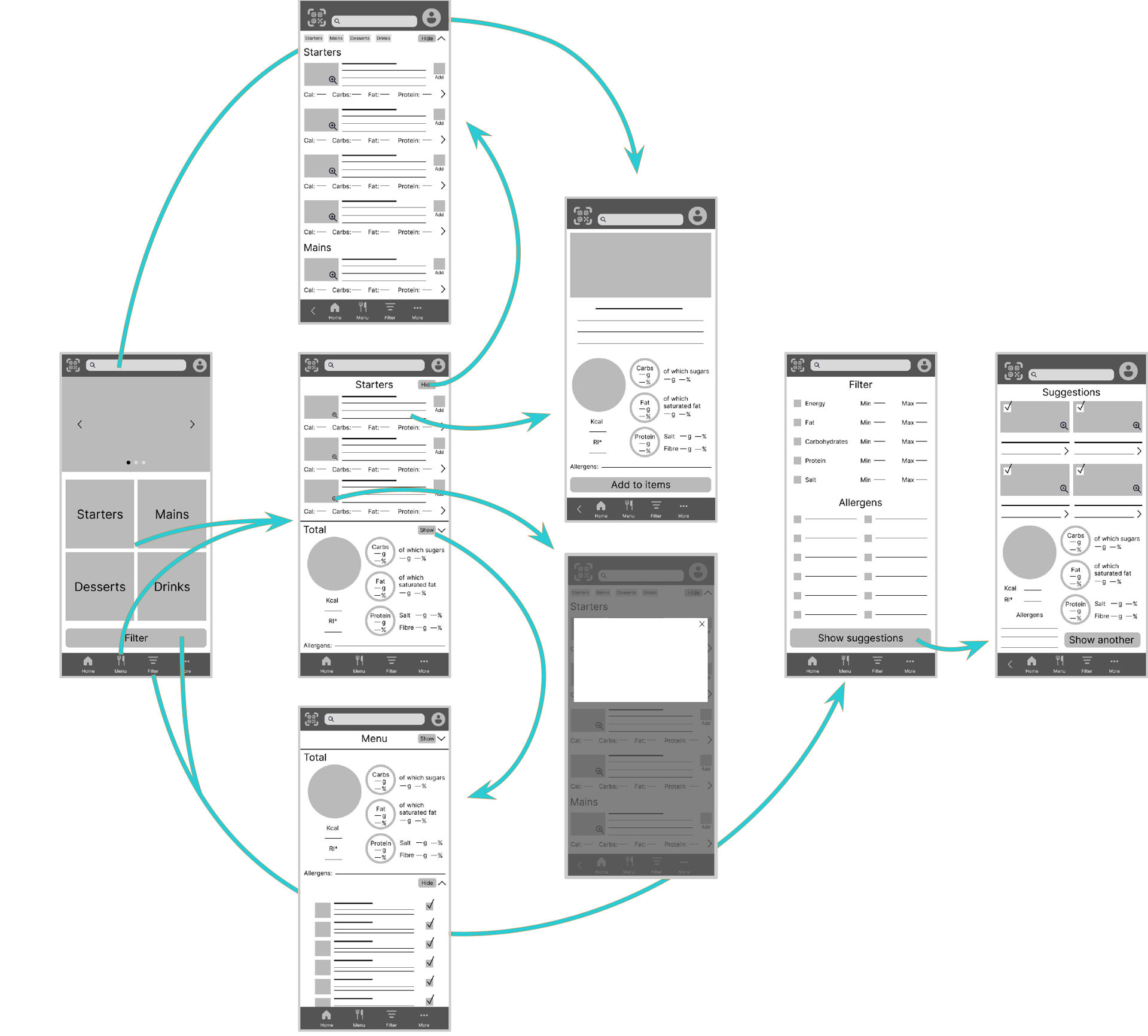
To anticipate user needs when interacting with the product, I developed a user flow to map the paths users could take through the app and identify the steps needed to complete key tasks.
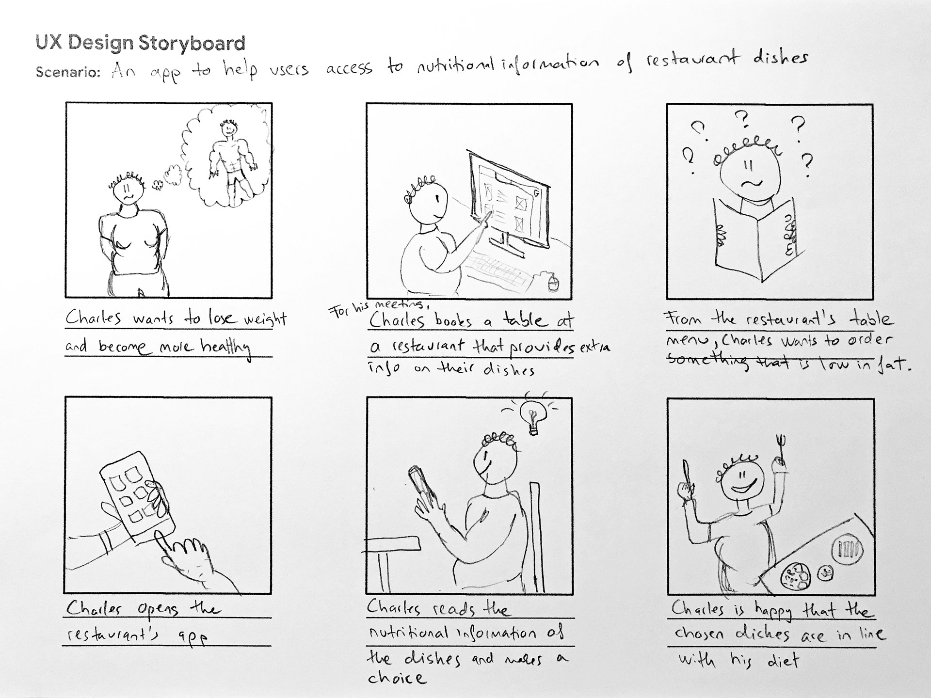
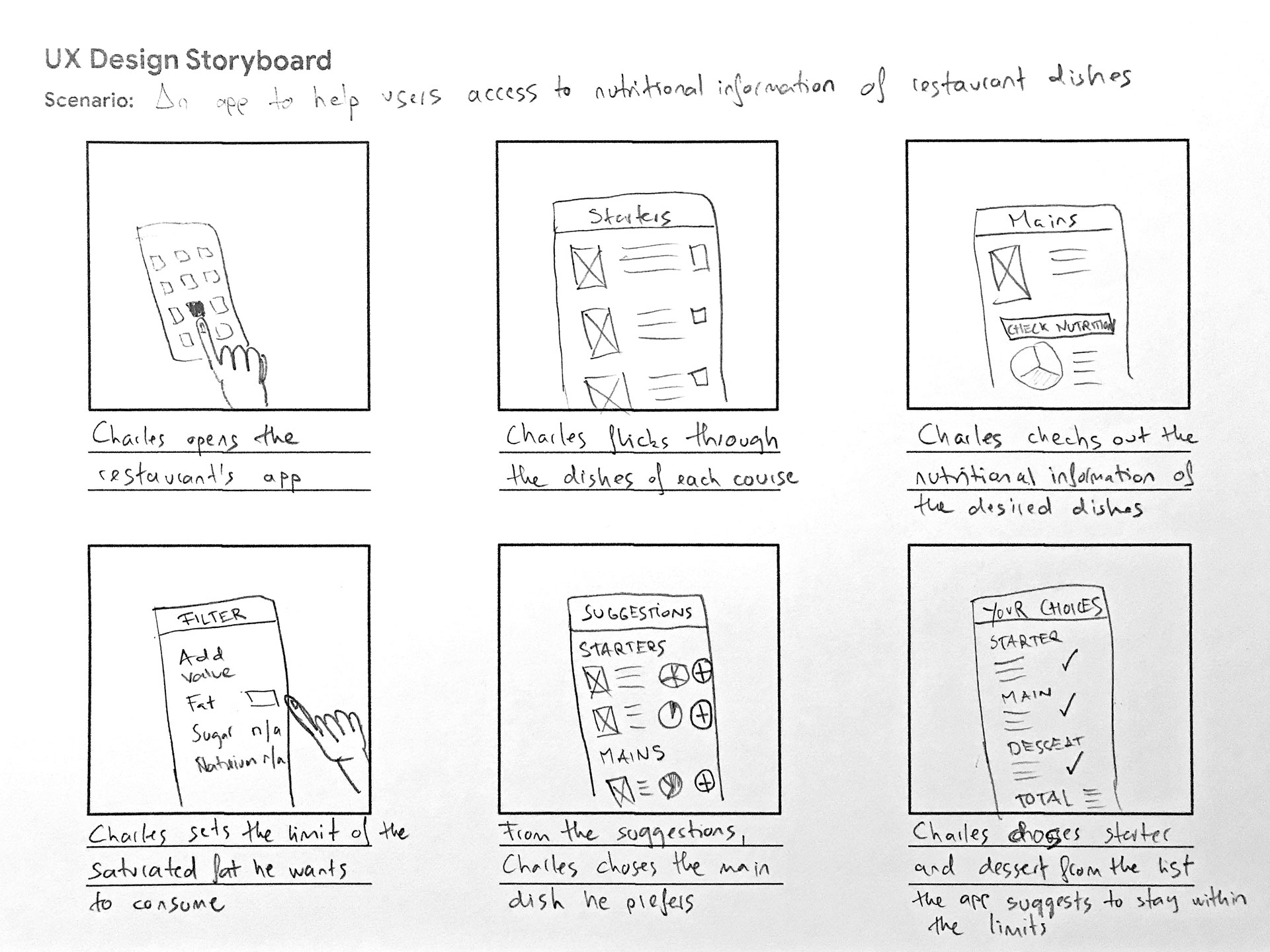
Then I created storyboards to explore the user's experience with the product. The 'big picture' storyboard shown here focuses on Charles' needs, the context in which he would use the app and why the product would be useful to him. The 'close-up' storyboard below was developed later in the design process, focusing on the product itself and how Charles would interact with it.
The next step was to create paper wireframes. Drafting iterations of each app screen on paper helped me explore different layouts and ensure that the elements carried forward into the digital wireframes addressed the user pain points identified during research. For the home screen, I emphasised quick access to the menu, filters and search options.
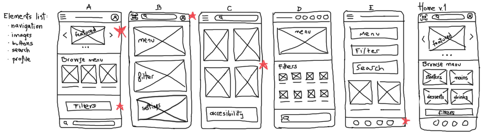
As the initial design phase continued and the information architecture was defined, I created additional paper wireframes before moving on to digital wireframes. Throughout this process, I kept Gestalt principles in mind and used the previously identified user needs and pain points to guide the screen designs.
Easy access to nutritional information while browsing the menu was a key user need to address.
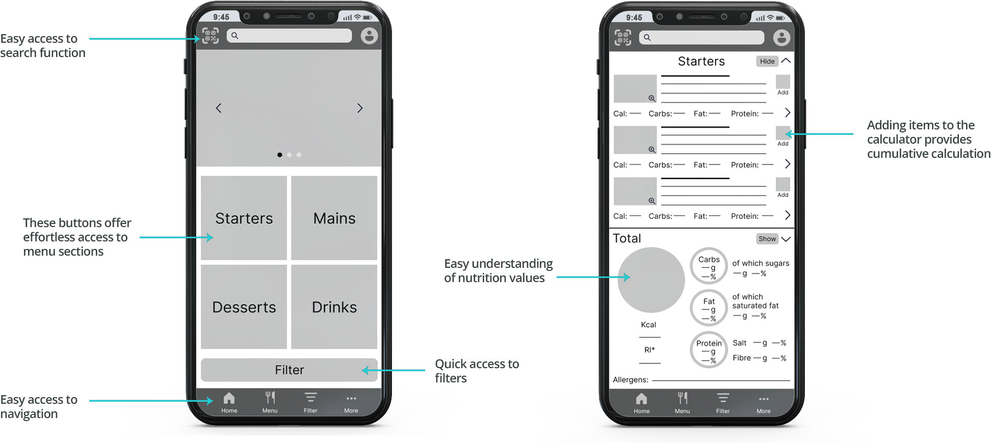
The low-fidelity prototype brought the primary user flow together, allowing users to view nutritional information, filter and search the menu, and access additional information about dishes and their nutritional values at any point in the user flow.
● Prompt 1: From the home screen, try to search for a particular dish.
○ Prompt 1 follow-up: How easy or difficult was this task? Would you change anything about the process?
● Prompt 2: Enlarge the image of a dish.
○ Prompt 2 follow-up: How easy or difficult was this task? Would you change anything?
● Prompt 3: Close the image and go through all sections of the menu (starters, mains, desserts, drinks) and view the detailed nutritional information for a dish you are about to order.
○ Prompt 3 follow-up: How easy or difficult was it to navigate the menu? Would you change anything?
● Prompt 4: Go back to the menu, view and interact with the TOTAL nutrition section, and find out more information about a pre-selected dish.
○ Prompt 4 follow-up: How easy or difficult was it to understand that the TOTAL section showed the cumulative nutritional values of multiple selected dishes? How easy or difficult was it to view the individual dishes included in the calculation? Is there anything you would change?
● Prompt 5: Let the app know that you can only consume 600 kcal.
○ Prompt 5 follow-up: How easy or difficult was this task? Would you change anything?
● Prompt 6: Edit your profile.
○ Prompt 6 follow-up: How easy or difficult was this task? Would you change anything?
● Prompt 7: What are your thoughts about the Nutrition Calculator app? What did you like or dislike about it?
○ The main user flow was clear.
○ I found the app unnecessarily complex.
○ I think the app was easy to use.
○ I would probably need the help of a technical person to be able to use this app.
○ I found the app easy to navigate.
○ There was inconsistency within the app.
○ I felt confident using the app.
○ I needed to learn many things before I could start using this app.
○ The nutritional information was easy to understand.
○ It was difficult to understand exactly what the nutrition calculator was showing.
After completing the research plan, I tested the low-fidelity prototype of the Restaurant Nutrition Calculator App through an unmoderated usability study. Participants received a link to the prototype test, during which their screens and narration were recorded. I reviewed the recordings and documented my observations using a note-taking spreadsheet. Each participant had a separate sheet where I recorded their click path, observations, quotes, task completion ratings, and time on task for each task, as well as the time taken to find nutritional information for a particular dish. (View usability study notes) Participants were anonymised, and the recordings were later destroyed.
Based on my notes, I created an affinity diagram to organise and synthesise the qualitative data, first into clusters and then into groups based on recurring themes and relationships. While sorting qualitative data is never easy, identifying patterns across participants greatly aided my understanding and interpretation of the findings. It helped me distinguish recurring usability problems from isolated difficulties and determine which issues required the most attention.
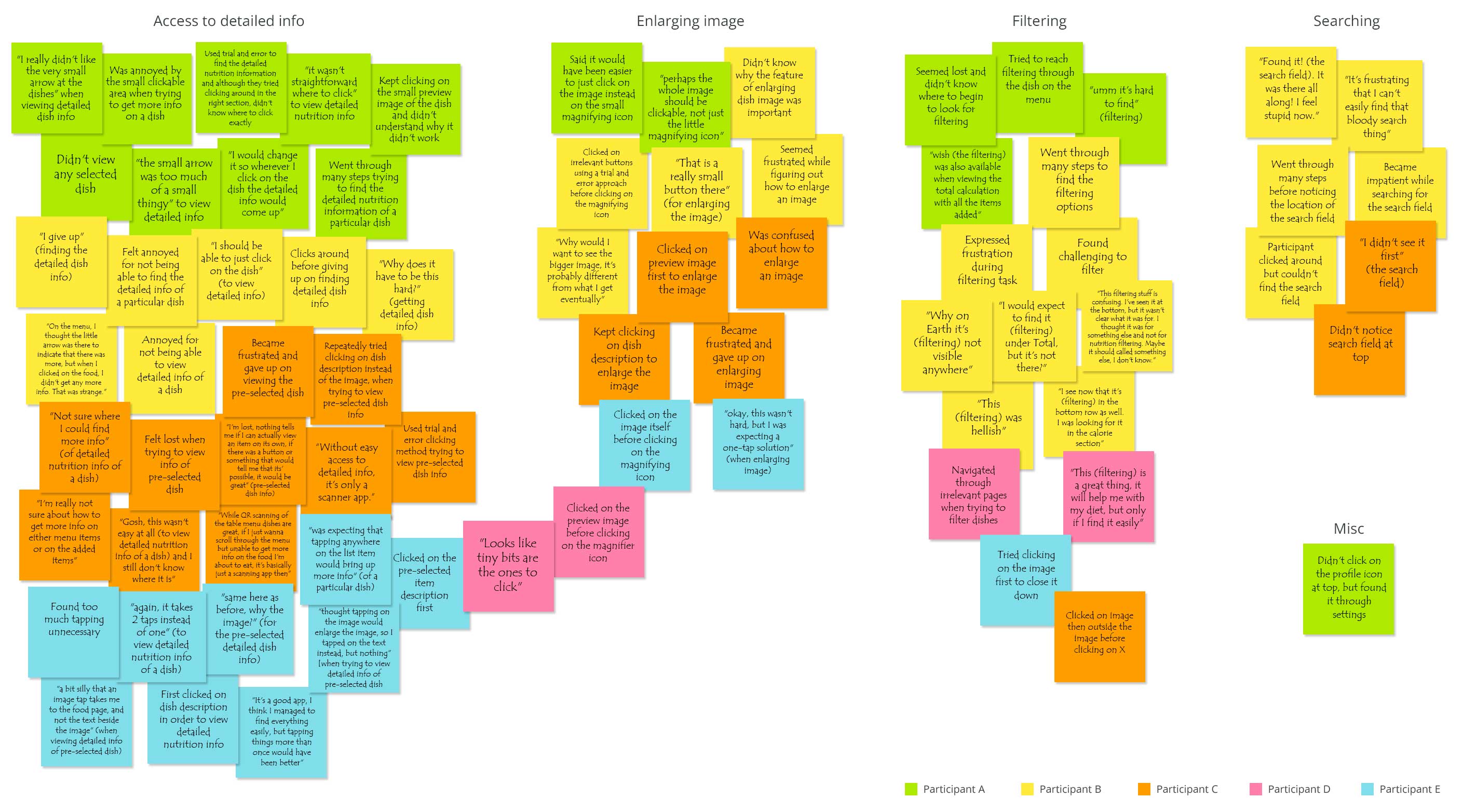
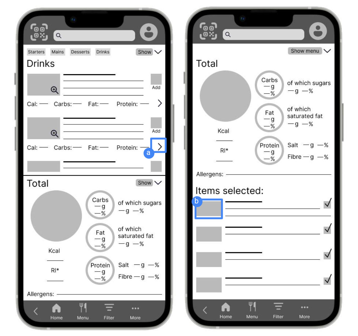
Detailed information was difficult to access.
Supporting evidence from the usability study:
● 4 out of 5 participants were either unable to access detailed information or took a long time to determine how to reach it.
● Participants tended to click on the text when trying to access detailed information.
Participant 2:
I should be able to just click on the dish.
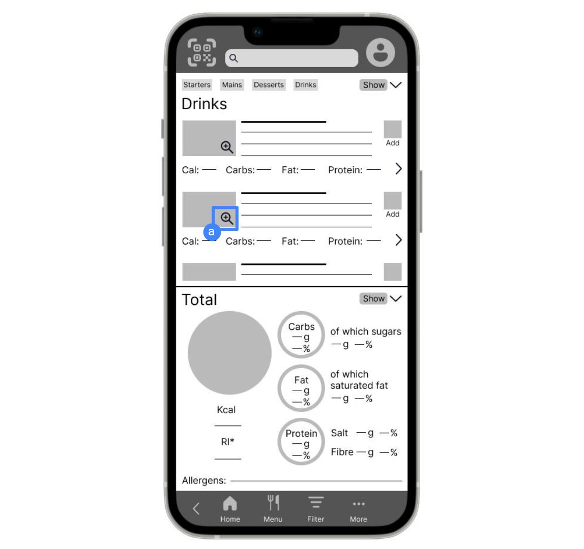
Enlarging dish images was difficult.
Supporting evidence from the usability study:
● 5 out of 5 participants were unable to complete the task on their first attempt.
● The interaction was not intuitive for participants, who expected the image itself to be clickable rather than relying on the magnifying icon.
Participant 3:
Would have expected clicking on the image would show the large image.
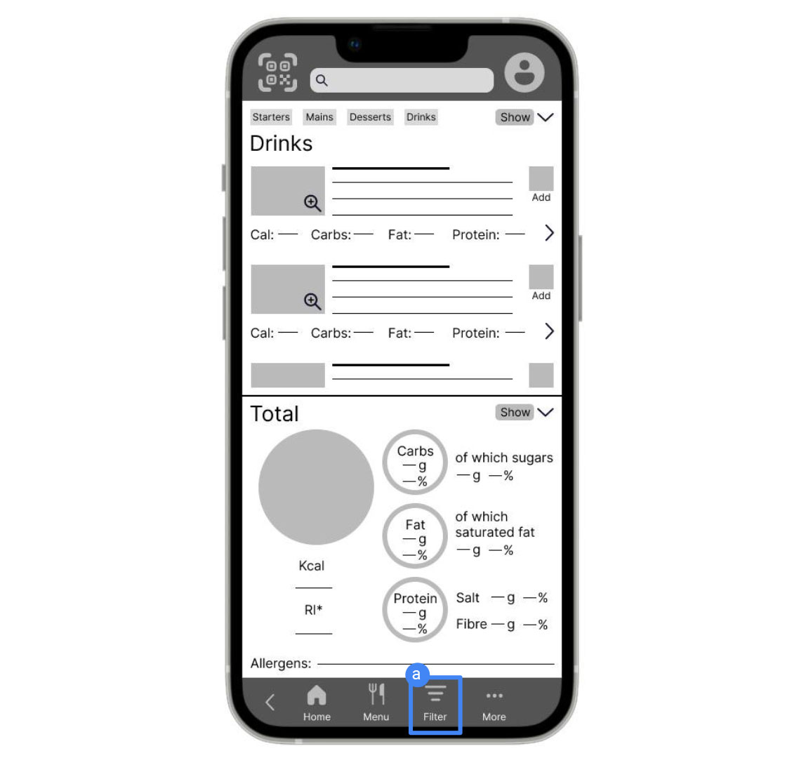
The filtering option was not prominent enough.
Supporting evidence from the usability study:
● 3 out of 5 participants had difficulty applying a calorie limit to the dishes.
● Some participants tried different paths through the app to find the filtering option.
Participant 4:
This is a great thing, it will help me with my diet, but only if I find it easily.
To generate meaningful insights based on real data, answer the research questions, and drive direct action to improve the user experience, I prioritised the findings to determine which usability problems required the most attention. I ranked the identified issues by severity, from P0 issues that prevented task completion and P1 issues that significantly hindered it, to P2 and P3 issues representing progressively less severe usability problems. I then focused primarily on the P0 and P1 findings when developing the following actionable insights:
Make the entire preview image clickable.
Consider additional locations from which users can access filtering.
After the first usability study, I incorporated the research findings and recommendations into the next design iteration. I reviewed the filtering option and explored additional paths for users to access it. I also increased the clickable areas of dish images and descriptions to better align the interactions with participants' expectations.
As I moved from the low-fidelity prototype to mockups and the high-fidelity prototype, I created a sticker sheet to help define the overall look and feel of the design and maintain visual consistency across the app.

To test the high-fidelity prototype, I conducted a second usability study with five new participants, using a methodology similar to the first study, but this time with moderated usability testing. The unmoderated format of the first study had provided limited qualitative insight, as participants tended to narrate very little while completing the tasks independently. Moderated testing allowed me to ask follow-up questions and gain a deeper understanding of participants' behaviours, expectations and difficulties as they interacted with the prototype.
Returning to the Total Nutrition section was difficult. 4 out of 5 participants needed help returning to the Total Nutrition section after viewing the full-screen menu, indicating a recurring navigation difficulty.
The Total Nutrition section occupied too much screen space while browsing. 3 out of 5 participants found the Total Nutrition section too large when they started browsing the menu, suggesting that it interfered with their ability to explore the menu comfortably.
Filtering did not behave as participants expected. 3 out of 5 participants expected to see a filtered version of the full menu after applying filtering options, rather than only receiving suggestions. This revealed an expectation for greater control over how filtered results could be viewed, indicating a mismatch between the existing filtering behaviour and participants' expectations.
Participants expected profile items to be directly editable. 3 out of 5 participants attempted to edit their profiles by clicking directly on individual profile items rather than using the "Edit Profile" button.
The top menu buttons were helpful to some participants. 3 out of 5 participants found the buttons at the top of the menu helpful.
The purpose of the "Add" button was unclear. 3 out of 5 participants questioned whether the "Add" button would add dishes to the nutrition calculator, indicating that its function was not immediately clear.
Based on the theme that participants had difficulty navigating back to the Total Nutrition section after viewing the full-screen menu, the insight was that they needed a clear and persistent way to return to it, leading to the recommendation to add a visible reference to the Total Nutrition section at the bottom of the screen that would bring the section back up when selected.
Based on the theme that participants were confused about the function of the "Add" button, the insight was that its purpose was not immediately clear, leading to the recommendation to better explain that it adds dishes to the nutrition calculator.
Based on the theme that participants found the Total Nutrition section took up too much screen space while browsing the menu, the insight was that they needed more space to explore the menu without losing access to their nutritional information, leading to the recommendation to reduce the size of the Total Nutrition section and display its details only when users choose to view them.
Based on the theme that participants expected to see a filtered version of the full menu rather than only receiving suggestions, the insight was that they wanted greater control over how they could view the results of their selected filters, leading to the recommendation to add a "View filtered menu" option alongside "Suggestions".
Based on the theme that participants tried to edit their profiles by clicking directly on individual profile items, the insight was that they expected these items to be directly editable, leading to the recommendation to make individual profile items editable without requiring the call-to-action "Edit Profile" button at the bottom of the screen.
After the second usability study, I scaled down the Total Nutrition section so users could browse the menu more comfortably and bring up the calculator in half-page or full-page view when needed. This revision also provided a clearer way to navigate back to the Total Nutrition section. I clarified the purpose of the "Add" button and further revised the filtering functionality by adding the option to view the full menu with the selected filters applied. Finally, I removed the "Edit Profile" button and made individual profile items directly editable to better align the interaction with participants' expectations.
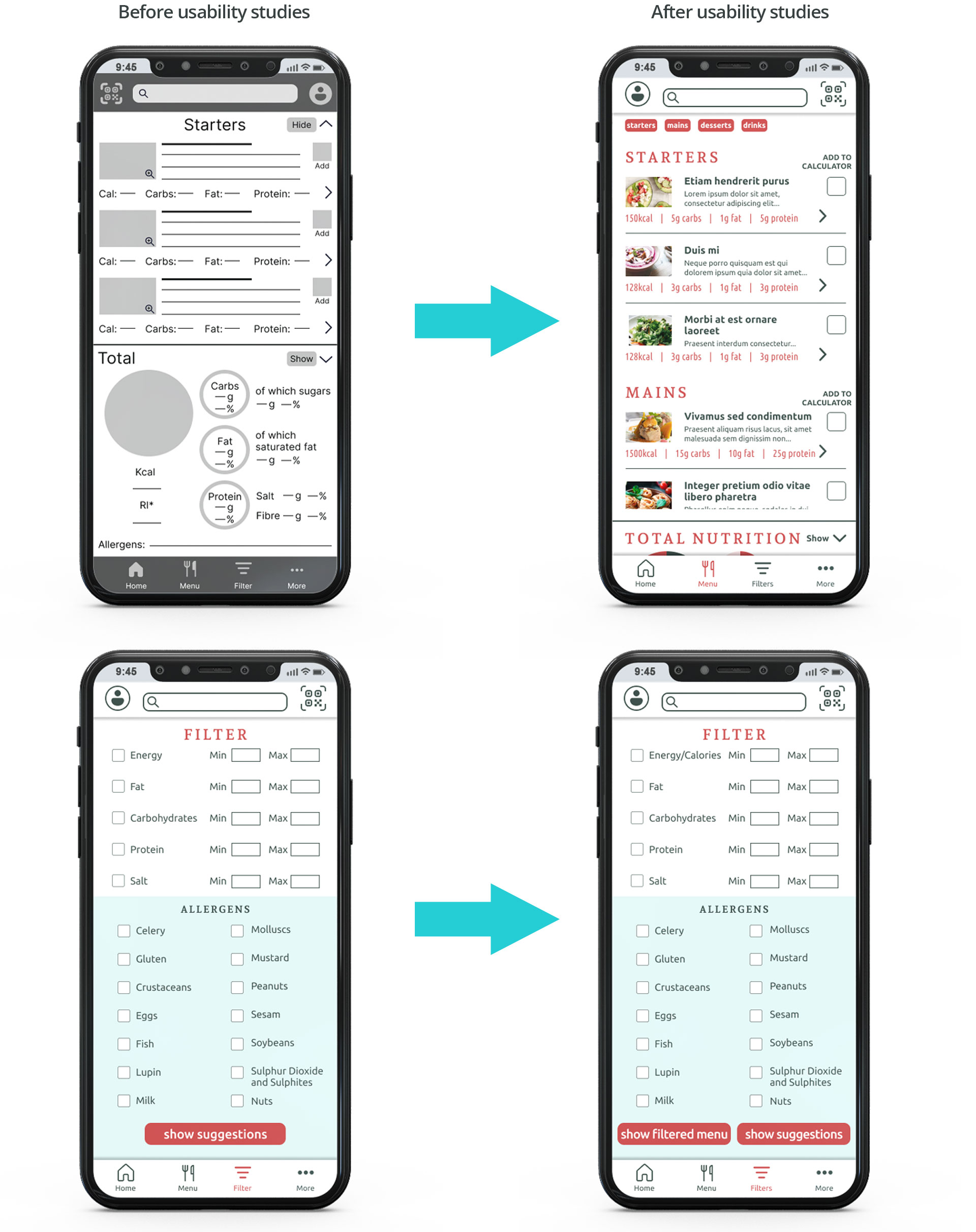
Keep swiping across the phone screen to browse through key mockup designs.
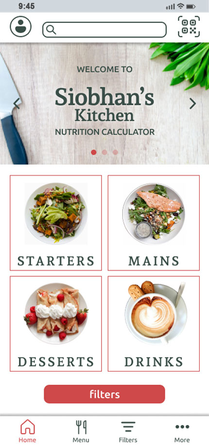
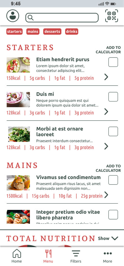
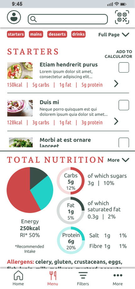
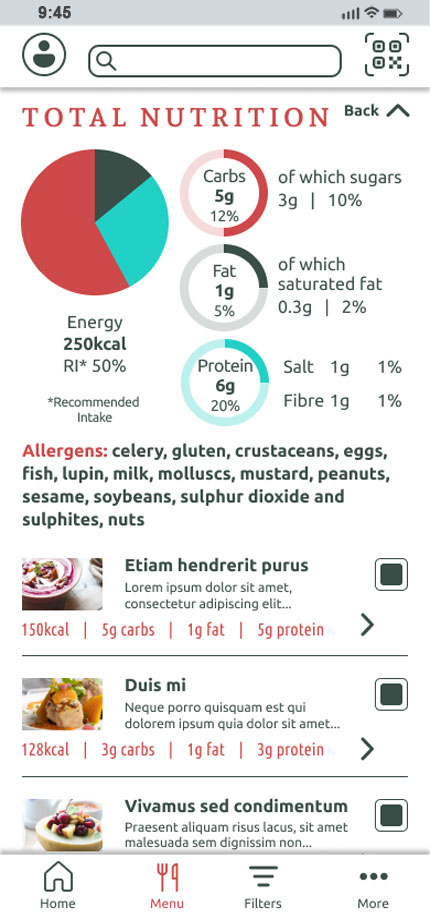
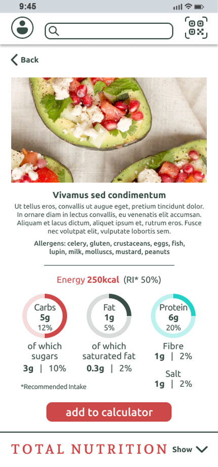
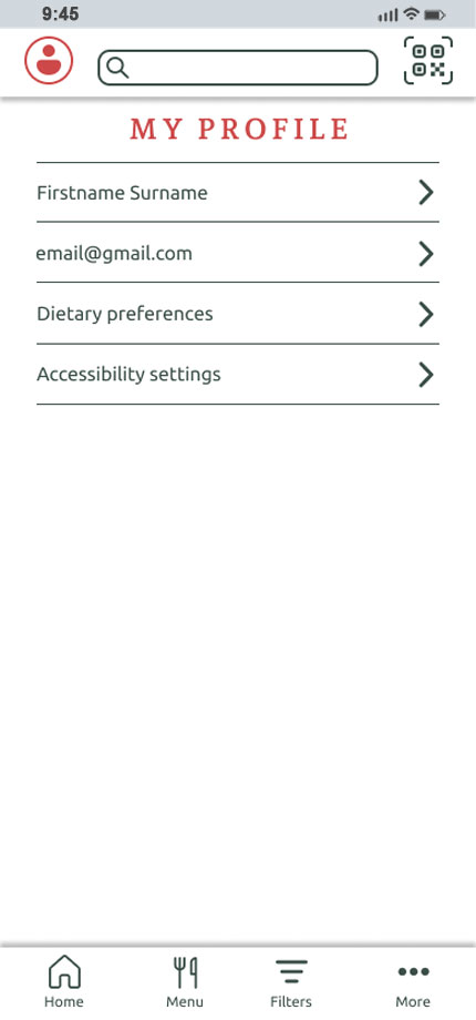
The final high-fidelity prototype incorporated the findings from both usability studies, addressing the identified pain points and aligning the user flow more closely with participants' needs and expectations.
Watch the video or click here to interact with the high-fidelity prototype in Figma.
Icons were used alongside interface elements to support recognition and navigation.
The minimum text size is now 12px, and colour combinations were checked and adjusted to meet WCAG 2.0 contrast guidelines. Alt text was also provided for relevant images to support users who rely on screen readers.
The design provides easy comprehension and navigation to help users interact with the app requiring minimal effort.
Impact:
By making nutritional information more accessible, the app has the potential to help users make more informed dining choices while supporting positive perceptions of the restaurant by reinforcing a sense of honesty, transparency and attentiveness to different dietary needs.
What I learned:
Designing an app from the beginning involves many interconnected steps, and understanding the user is crucial throughout the process. The two usability studies showed me not only how valuable iterative testing is, but also how the chosen research method can affect the depth of the insights gathered. After finding the unmoderated study somewhat limiting in terms of participant narration, using moderated testing in the second study allowed me to ask follow-up questions and gain a deeper understanding of participants' behaviours and expectations. I also learned how important it is to turn research findings into prioritised, actionable insights and carry them through to design decisions. At the same time, the project highlighted areas for my own development, particularly the need to continue improving my interviewing and moderation skills through practice.
● Conduct further user research to identify additional needs and explore how the app could support a wider range of dietary requirements.
● Conduct another usability study to evaluate whether the changes made following the second study successfully addressed the identified pain points and introduced any new usability issues.
The sign-up process for a cryptocurrency exchange is one of the first interactions users have with the platform and can contribute to their initial impression of it. While users have many options when choosing where to exchange cryptocurrency, this product was designed for a centralised exchange platform aiming to encourage user loyalty.
Signing up for a cryptocurrency exchange can involve multiple steps and unfamiliar requirements, potentially creating difficulties for users with little or no previous experience with cryptocurrency platforms.
Because the sign-up process can influence users' initial impressions of a platform, the goal was to design a clear and straightforward user flow that accommodates both novice and experienced cryptocurrency users.
As a UX generalist, I conducted interviews and prepared surveys to identify user problems and generate insights for the ideation phase. Based on the research findings, I created personas, empathy maps and user journeys, followed by user flows, paper and digital wireframes, and low and high-fidelity prototypes. I also conducted usability studies, considered accessibility throughout the process and iterated on the designs based on the research findings.
I conducted user research through interviews and surveys to understand users' frustrations, needs and requirements during the sign-up process. Using a mixed-methods approach, I combined qualitative and quantitative data to identify recurring pain points and gain insights into how the challenges differed between experienced and inexperienced users, which informed the following empathy maps:
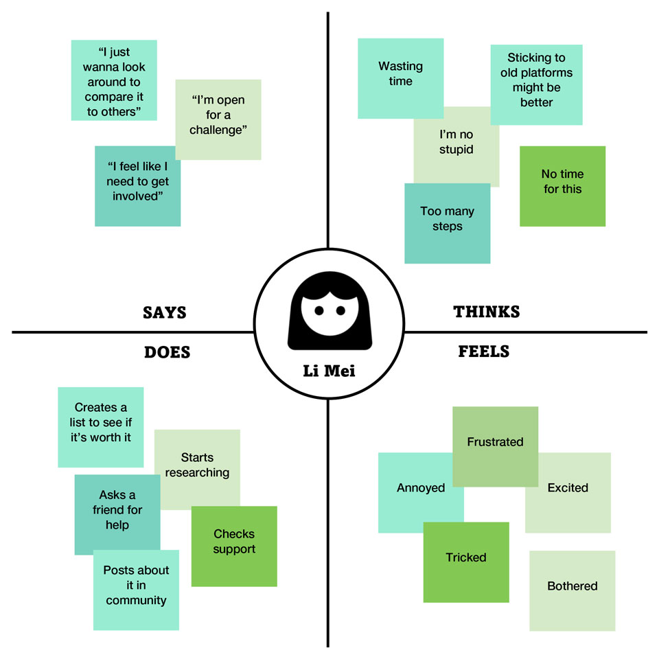
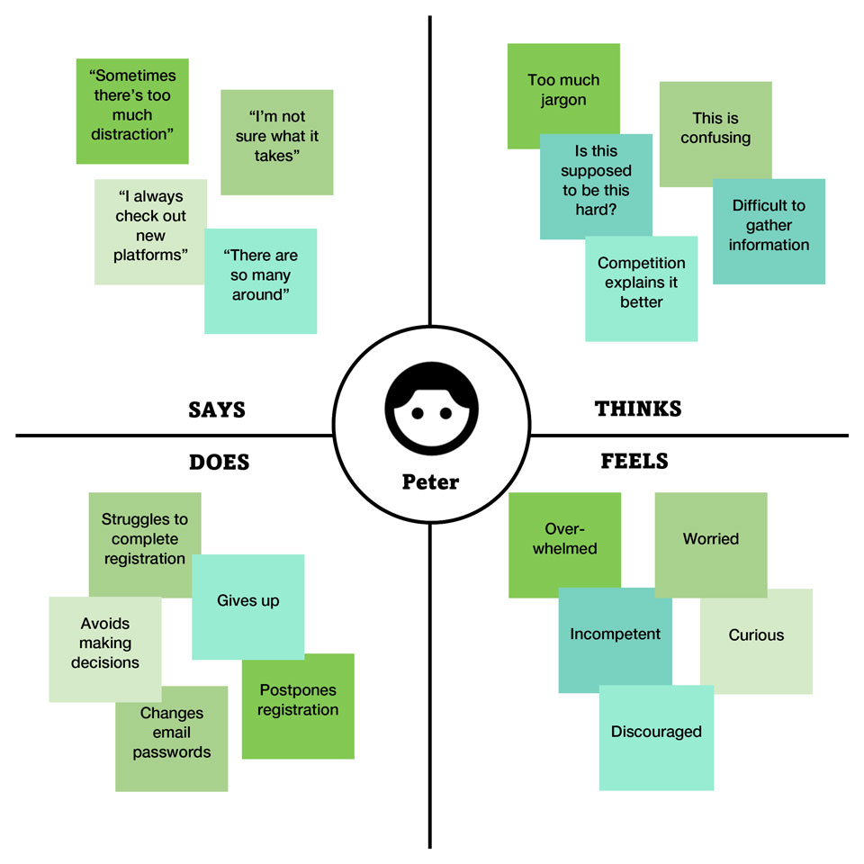
One of the key pain points was the length of the sign-up process, which users found time-consuming. Participants wanted a more straightforward process and the option to explore the platform without fully committing during sign-up. Inexperienced users also struggled with information that they found confusing or insufficiently explained.
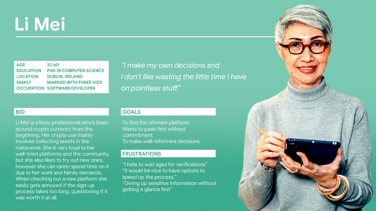
Li Mei's user story:
As an experienced and busy professional with family commitments, I want to sign up quickly and without obligation so that I don’t waste my time on something that might not be worth it.
Li Mei's user journey map:
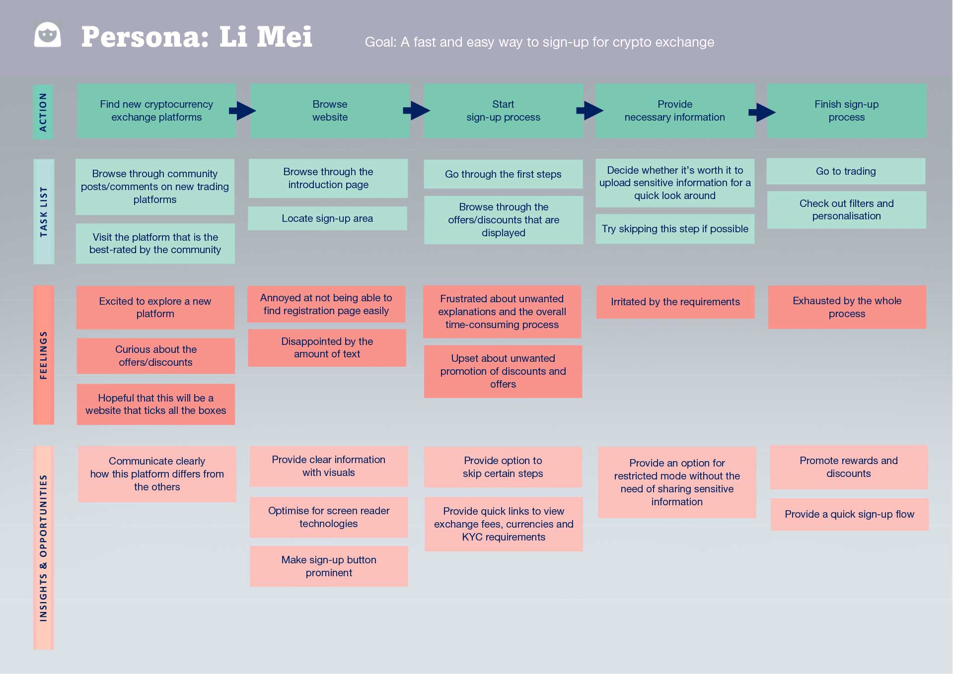
Problem statement:
Li Mei is a busy individual who needs a quick and easy sign-up process because they don’t want to waste their time.
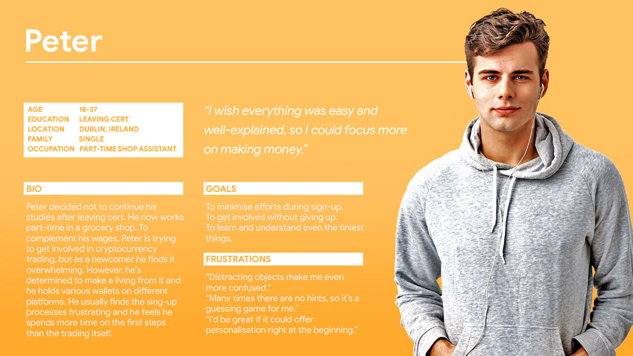
Peter's user story:
As a novice user, I want to receive tips and explanations in a less distracting environment so that I can better understand the information presented to me and focus on what I’m doing.
Peter's user journey map:
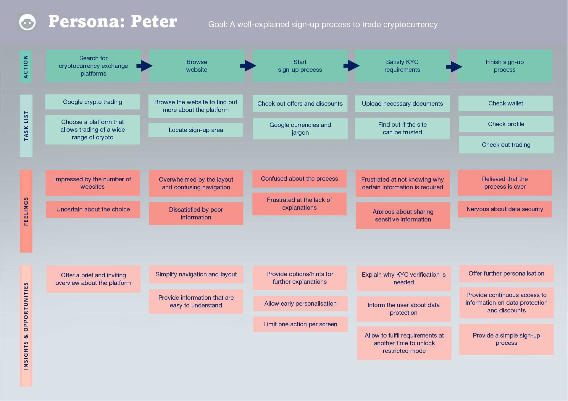
Problem statement:
Peter is a new trader who needs a well-explained sign-up process because they are unfamiliar with crypto trading.
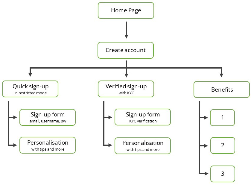
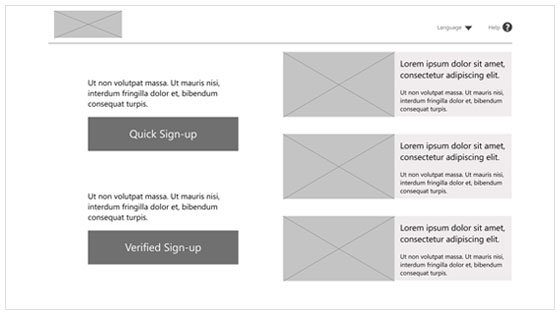
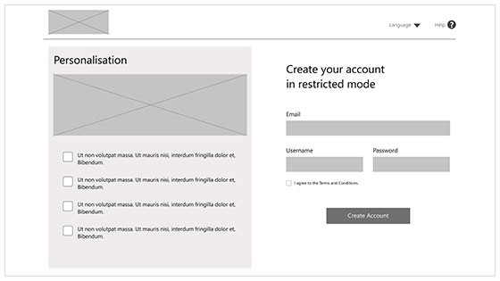
As the process required a relatively simple solution to address the needs of the personas, I aimed to keep the information architecture simple, so I designed the user flow to present users with two options at the very beginning, allowing committed and non-committed users to choose a path quickly to address the pain point of a lengthy sign-up process. I already had a sitemap in mind and quickly drew it up. I then realised it would be worth checking out the competition, so I embarked on a competitive audit. However, between the sign-ups, throwaway email accounts, verifications and seemingly never-ending registration processes across various platforms, the audit took an enormous amount of time. To compensate for the time spent on the sign-ups, I skipped storyboards completely. Looking back, I believe skipping this step may have contributed to the confusion I experienced when I later dived into high-fidelity mockups, as I moved into visual design without further exploring the personas in context. However, while the sign-ups were indeed as painful as the user research had suggested, conducting the audit was very beneficial. Using the "How Might We" approach, I decided to stick with the simple sitemap I had already planned, and explored some ideas for the layout.
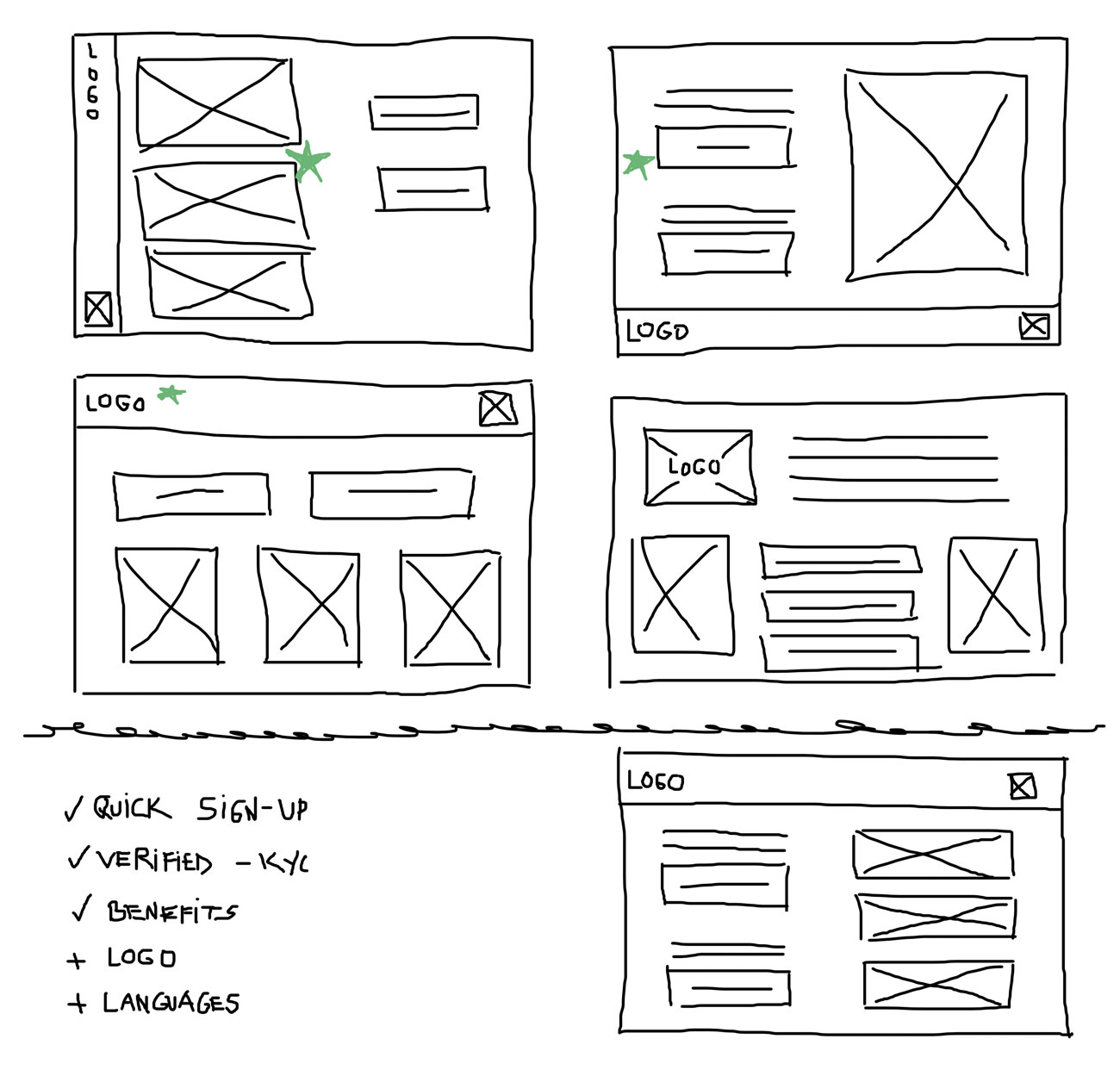
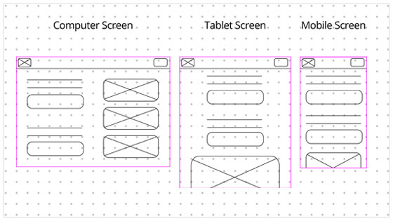
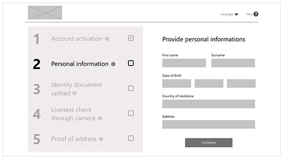
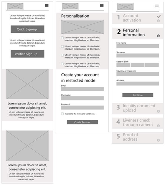
Keeping responsiveness in mind, my wireframes started to take shape. Here, I went with the practice of "graceful degradation" for no other reason than to provide users with as much helpful information as possible when more screen space was available, and make the primary task as easy as possible to complete when screen space was limited. While the desktop version provided more supporting information alongside the primary task, the mobile version reorganised the content into a single-column layout, keeping the information necessary to complete the task immediately visible and making supplementary content available on scroll.
I went with mixed methods again, using interviews with open-ended questions for qualitative data and a survey for quantitative data. As I wanted to gather as much data as possible, I chose moderated testing to avoid the scenario I had encountered previously, where participants provided very little narration during unmoderated testing.
For the interview script, I consulted AI to see if it would save time. While I didn’t save much time due to rigorously reviewing ChatGPT’s outputs and eventually maxing out the available prompts (which was a lot), in the end, I found it to be a valuable addition to the process.. The script became more organised and logical, and conversing with the AI also nudged me to explore different avenues. All in all, I found it valuable and fun. Once the script was finalised, I conducted a pilot study just in case.
Then, the pilot interviews were a complete failure. I realised that recruiting participants with a strong negative attitude towards cryptocurrency had been an oversight on my part. As they had little or no interest in using a cryptocurrency exchange, I could not gather usable data at all to evaluate the sign-up experience for the intended target users. For this reason, I decided to add a pre-screening step before the next set of interviews, as the aim was to recruit a cohort with at least some interest in cryptocurrency, ranging from potential new users to those with previous experience. The Screening Questionnaire was just a short survey designed to determine whether participants met the selection criteria.
Participants were between 18 and 55, and the sample included individuals with motor impairments.
Crypto Enthusiasts
These users are familiar with various cryptocurrency trading platforms and can provide valuable feedback on the nuances of the sign-up process compared with other platforms they have used.
Potential New Users
Individuals who are interested in entering the world of cryptocurrency but have not yet done so. Their feedback can highlight how intuitive and welcoming the sign-up process is for newcomers.
Occasional Traders
Users who have some experience with cryptocurrency but do not trade frequently. They can offer insights into barriers that might prevent them from becoming more active users.
Relevant Feedback
Participants who are interested in crypto trading are more likely to provide feedback that is relevant to the specific area and reflects the needs and expectations of the intended target users.
Usability Insights
Participants with an interest in cryptocurrency can offer insights into specific features and expectations of the sign-up process, while different levels of experience can help reveal the needs of both novice and experienced users.
Better Evaluation
Participants who could realistically consider using a cryptocurrency exchange are better positioned to evaluate the sign-up process and provide detailed and actionable feedback on the experience.
5 out of 5 participants explicitly mentioned that the placeholder content did not motivate them to sign up and wanted more detailed information about the benefits.
Motivation and Engagement
Need for Real Content: The placeholder images and limited text made it difficult for participants to understand the benefits of signing up and reduced their motivation to continue.
Realistic Content Helps Communicate Value
Participants needed more realistic and detailed content to understand the platform's value proposition and make an informed decision about signing up.
Recommendation
Enhance content with real information.
Replace placeholders with realistic images and detailed information explaining the benefits of signing up.
3 out of 5 participants felt that the help button was not immediately obvious and suggested making it more prominent.
Help and Assistance
Help Accessibility: The help function was not sufficiently prominent for some participants to notice it easily.
Help Needs to Be Easy to Find
Participants needed help and support to be readily discoverable during the sign-up process, particularly when additional assistance was required.
Recommendation
Make help more accessible.
Increase the prominence of the help icon and ensure that it is easily accessible, including for users with impairments. This could involve increasing its size or adjusting its visual prominence.
3 out of 5 participants did not immediately realise that the step indicators were clickable and suggested clearer indications.
Navigation and Progress Tracking
Usability and Navigation: Participants appreciated the structure provided by the step indicators but highlighted the need for clearer navigation cues.
Clickable Elements Need Clearer Cues
While the step indicators on the left were useful, participants needed clearer signs or instructions to recognise that they could also be used for navigation.
Recommendation
Improve navigation cues.
Add tooltips or more prominent visual cues to indicate that the step indicators on the left are clickable.
While it is generally good practice to conduct usability testing early to avoid wasting time, effort and money, in this particular case I began to question whether I had tested too early. Because the sign-up process was relatively short, the placeholder content in the low-fidelity prototype became a significant part of participants' feedback and made it more difficult to evaluate their response to the experience itself. In hindsight, developing more realistic content before conducting the study may have produced more useful findings.
Finally, the time had come to create the high-fidelity prototype. I already had a theme in mind, and I knew I wanted to deviate from the current trend of minimalist, white-background sign-up processes that I had encountered during the competitive audit. I wanted to create something sleek but also magical, marking the entrance into an inviting, modern new world and offering a sense of “getaway”: a world of its own.
With that idea in mind, I started browsing AI-generated imagery (particularly the kind of highly stylised imagery produced by Midjourney).
Until… I came across some images that perfectly fit the idea in my head:
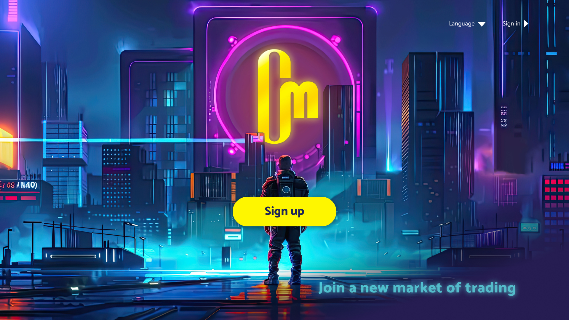
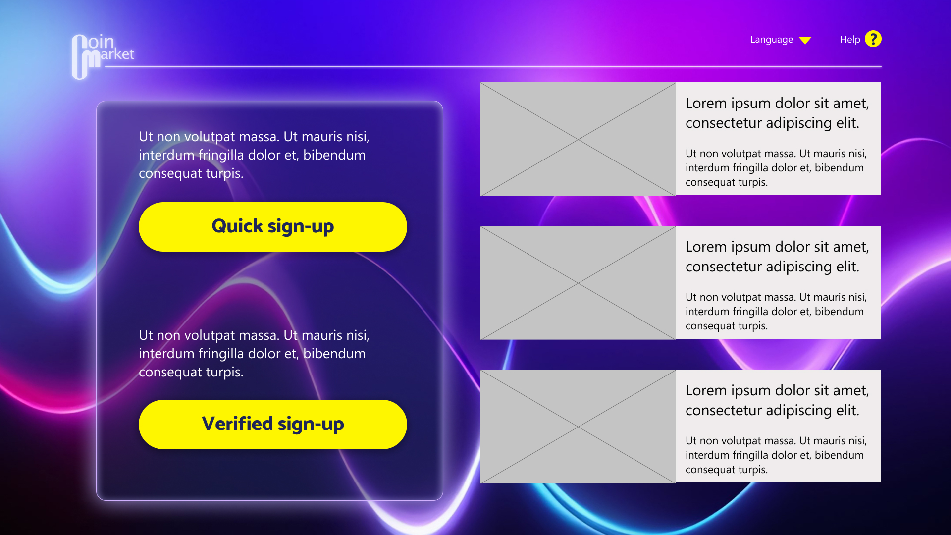
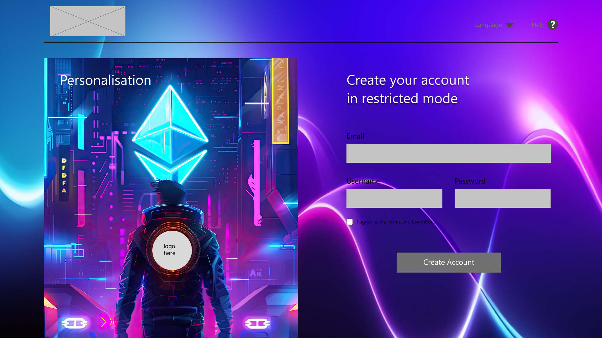
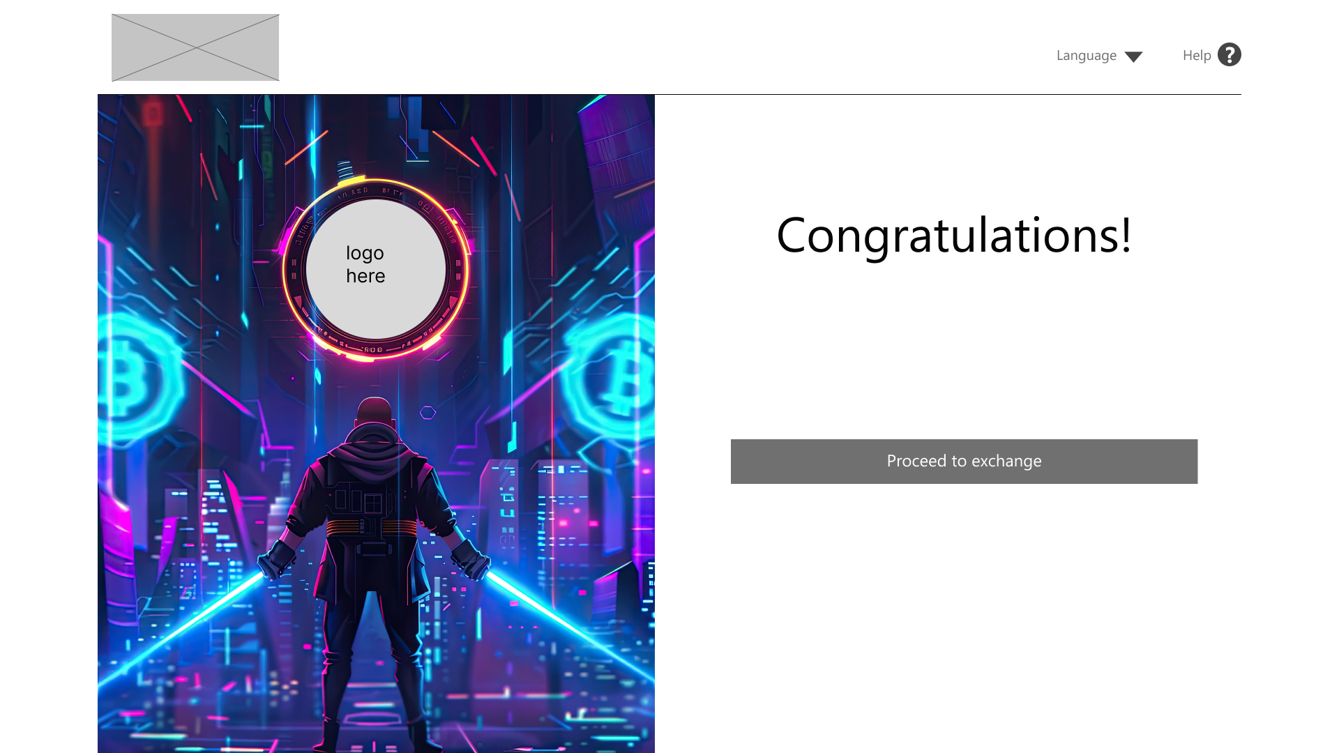
However, I think I managed to overdo my own brief. Another failure occurred, and this time, it was a total failure that almost became a complete disaster…
I honestly thought that representing the experience of entering a new world through a character in a cyber world would be a great idea. That’s how my thinking became clouded by my own bias. Looking back, the fact that I was working in the game industry, my admiration for cyber worlds, and my disregard for some critical factors revealed by my very own user research probably all contributed to my journey down the rabbit hole.
Luckily, I had only managed to do up a few pages when my usual doubts about my work stopped me from going forward. This time, however, they didn’t want to go away, so I began investigating. I had a hunch that perhaps it was rooted in the fact that the personas and the design itself were not lining up. After carefully inspecting the personas and their user journeys, I realised that my doubts had some basis: the design I was creating did not align well with the needs of both personas and had been heavily influenced by my own preferences. Neither the personas nor the research indicated that the target users were gamers, interested in cyber worlds or likely to connect with this type of visual experience. Those characteristics had come from me, not from the users. As an additional reality check, I asked some friends to imagine themselves as each of the personas and respond to the design. They felt that while Peter might get excited by the unique design, Li Mei might leave the site as soon as she saw the sign-up page. I had to reconsider the design, and while doing that, I thought about the debate around whether personas are necessary or simply a waste of time. In my case, they proved extremely valuable. Returning to the personas and their user journeys provided the reality check I needed and helped me recognise how far the design had drifted from the needs identified during research. I was thrilled to have that. So, I made some adjustments:
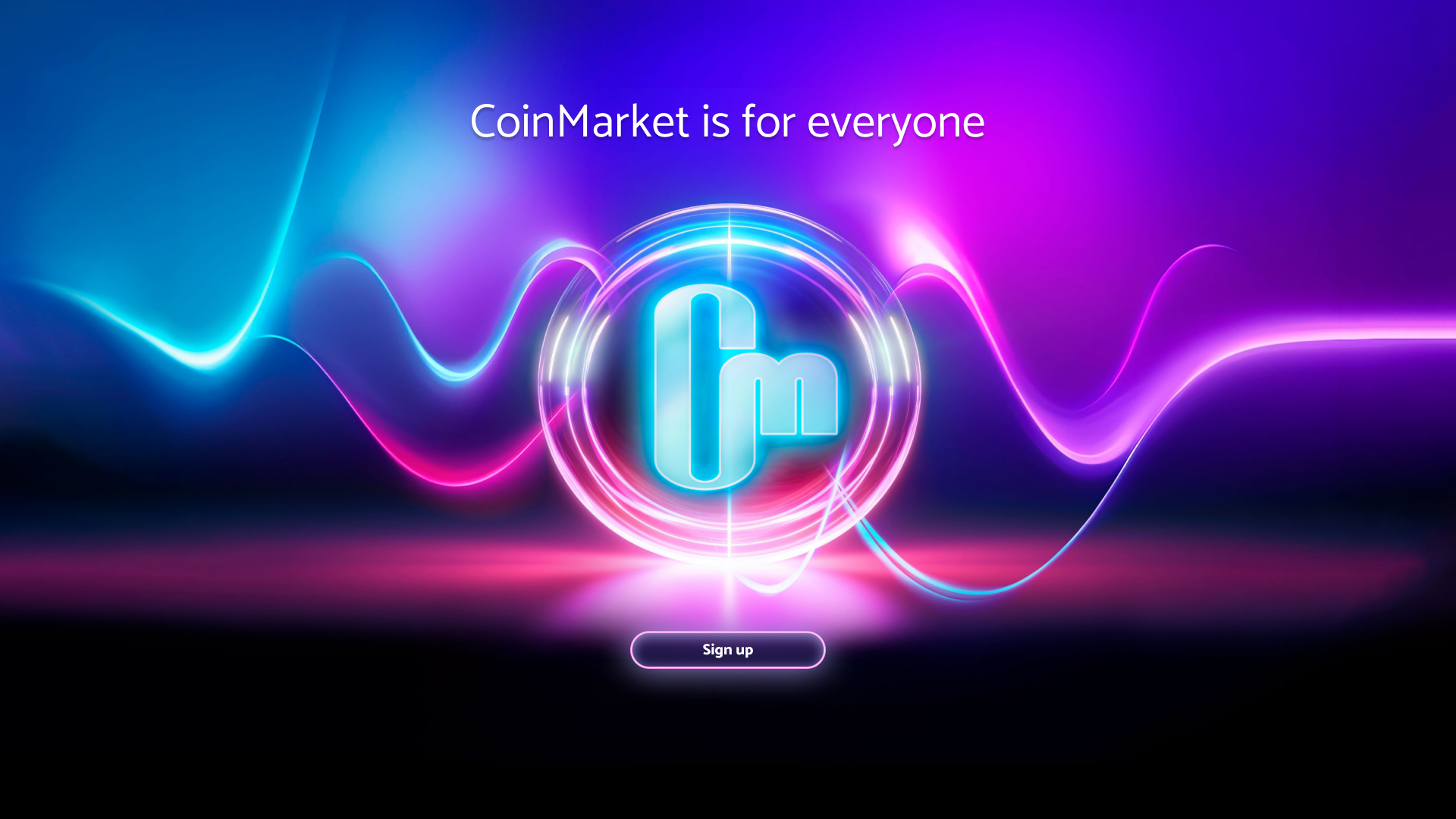
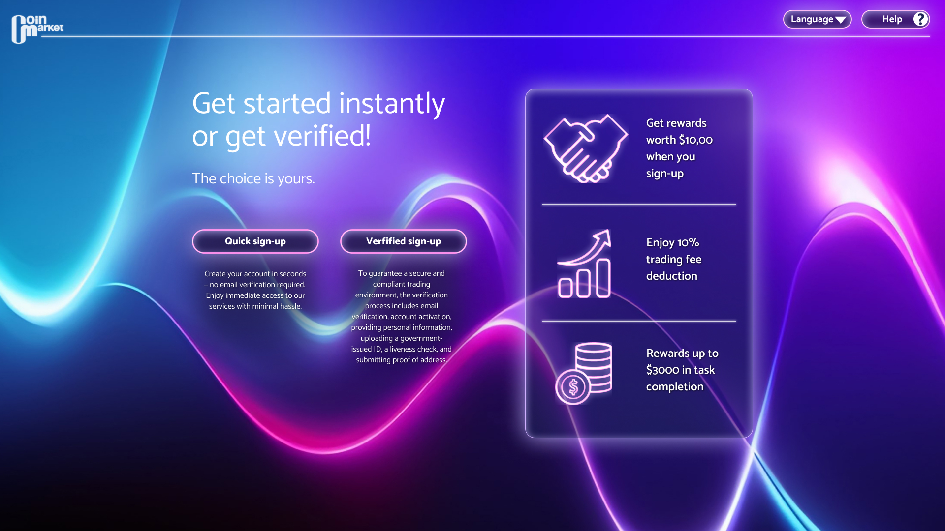
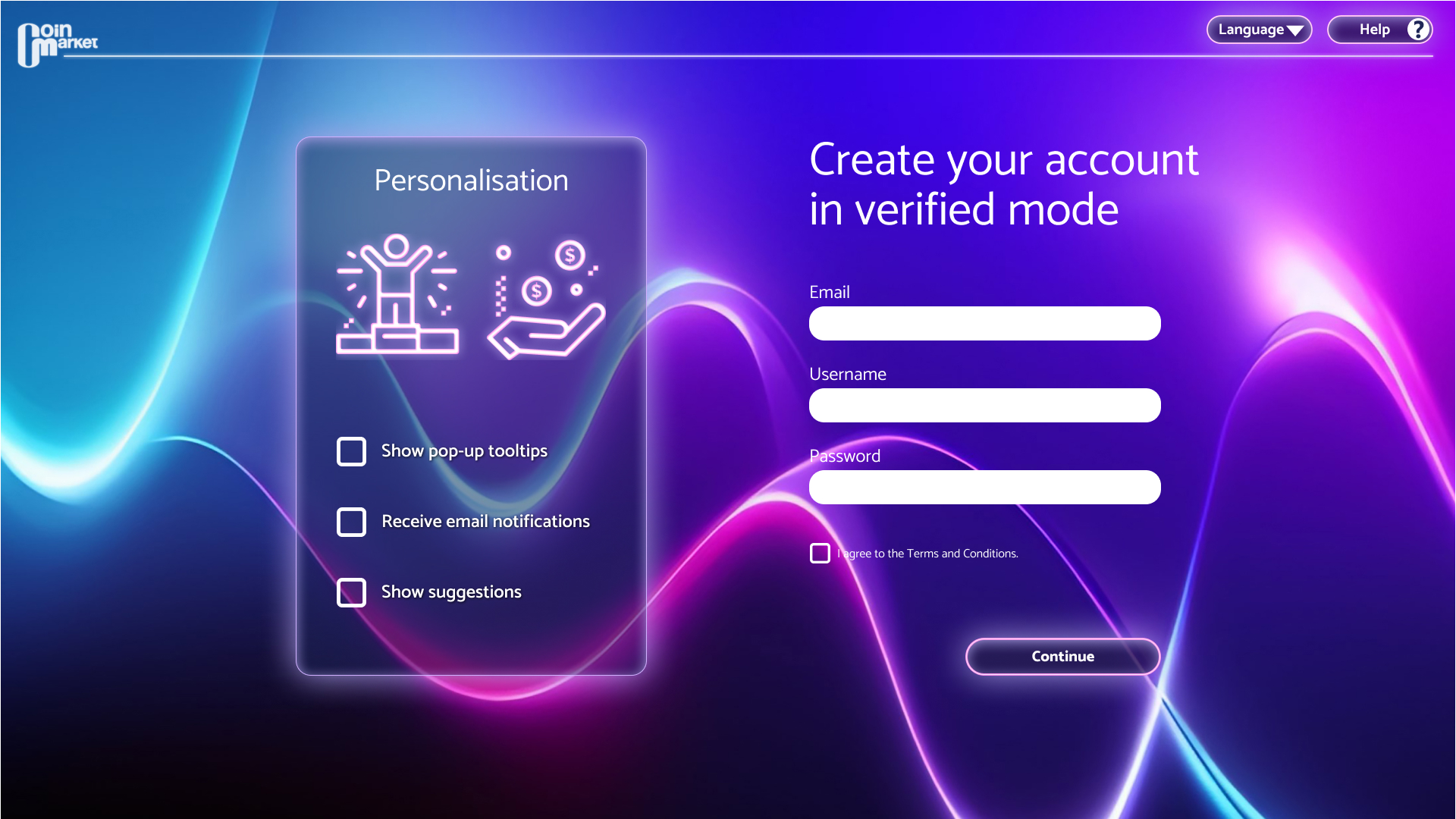
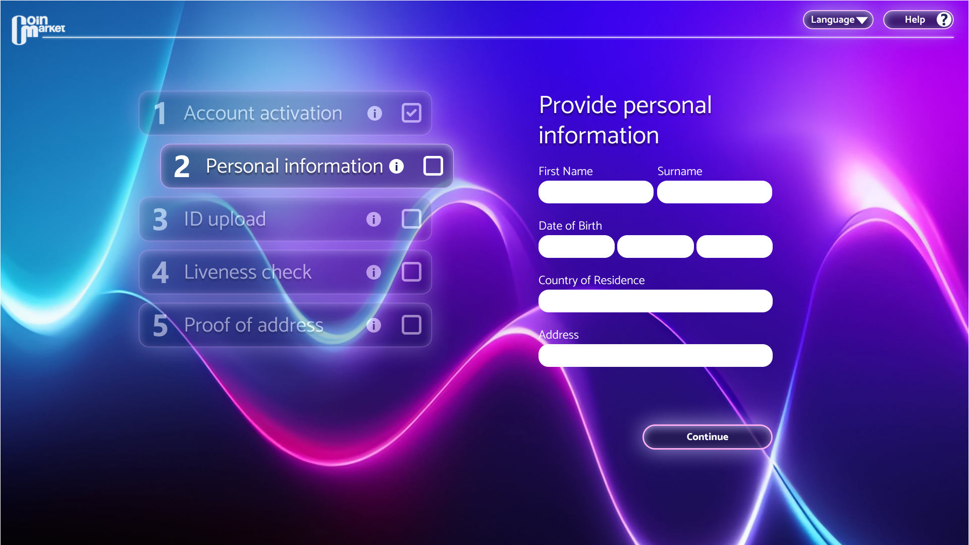
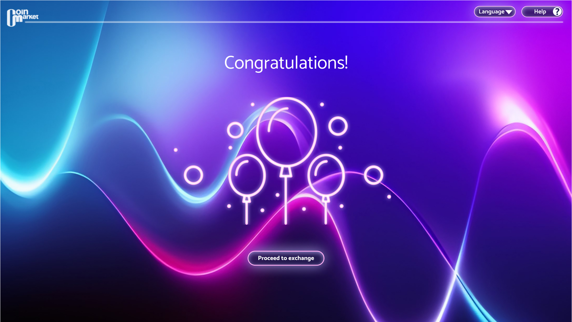
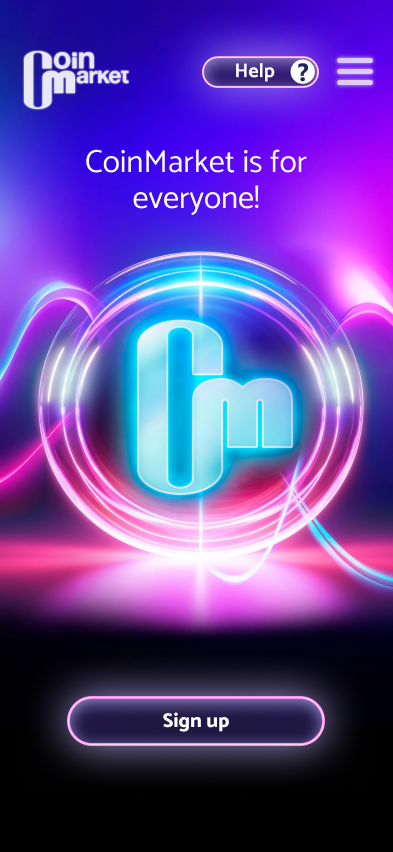
Although I wasted some time on the wrong design, all was not lost. I kept the dark theme for various reasons. I remembered the earlier days of crypto sites, when dark, mysterious aesthetics were much more common, but by the time of this project, they had primarily moved towards a more minimalist, corporate feel, with only a few exceptions. I wanted to pay homage to those earlier beginnings while also setting my design apart from the cold, dull, corporate-looking sites I had encountered during the competitive audit. I tried to create a site that suggested an exciting experience instead of just another trading platform with a sleepy look. Adjusting the failed theme, I toned down the gamer concept to better align it with the target audience while still retaining the magical and welcoming feel I originally wanted to create.
Below is the prototype to interact with:
The use of hierarchical headings helps users quickly find the relevant sections.
The high contrast ratio of the text was designed to enhance accessibility.
The use of labels is helpful for people using assistive technology, as it makes navigation easier.
This project taught me how easily my own preferences and experiences can influence design decisions without me immediately realising it. Returning to the personas and user journeys provided the reality check I needed when my initial high-fidelity design drifted away from the needs identified during research. It also reinforced the value of personas for me, not simply as design deliverables, but as tools I could return to throughout the design process.
I also learned valuable lessons about research planning. My unsuccessful first set of interviews demonstrated the importance of recruiting participants who represent the intended target users, while the first usability study made me reconsider how early testing should be approached. Testing early can be valuable, but the prototype still needs to provide enough realistic content to answer the research questions effectively.
• Conduct further user research to identify additional needs across users with different levels of cryptocurrency experience.
• Conduct another usability study to evaluate whether the final design successfully addressed the pain points identified in the first study and whether the revised visual direction works for both novice and experienced users.

I was solely responsible for the high-fidelity design, which involved substantially reworking the earlier low-fidelity prototypes. I created a new user flow and developed the complete visual direction, including the colour theme, logo, sticker sheet and all high-fidelity screens.
This project was completed as part of a group assignment for an MSc Human-Computer Interaction module. Each team member contributed to different parts of the project and wrote their own section of the academic write-up. Below is my individual contribution to the write-up.
Developing the conceptual model for the high-fidelity prototype required a re-visit of the personas to empathise with the user and offer solutions to user needs (Preece et al., 2019). After carefully considering user needs, the first step in the development was to identify a user flow that follows the initial idea, where volunteers and people in need can use the same app. Therefore, the main challenge was ensuring the navigation accommodated both types of users. To satisfy this requirement, the app offers a choice very early in the user flow, which then continues on a path tailored to the user’s current need, whether they are volunteers collecting recyclables or users who need assistance with recycling. Further considering the conceptual model and user needs, focusing on what they require to complete their actions, a hierarchical model was identified for the information architecture, based on the Eight Principles of Information Architecture: the principle of objects, choices, disclosure, exemplars, front doors, multiple classifications (Brown, 2010). While the lo-fi mock-ups provided a great starting point, the high-fidelity prototype deviated significantly from those in terms of screens and screen layout. A splash screen was added to identify the starting point and elevate user experience (Huang & Chiu, 2024), followed by an onboarding screen – to help users start quickly – which then leads to an easily navigable onboarding flow to allow users to familiarise themselves with the app using minimal cognitive effort (Tokarova & Weideman, 2013). The step indicator throughout the schedule screens also enables the user to follow their progress and know where exactly they are in the process, which is recommended in a three- to five-step process for a better user experience (Huang et al., 2024).
In addition to the user flow, the design process of the screen layouts started with the development of a design system, focusing on buttons, typography, and a colour palette to ensure the artworks maintain consistency (Lamine & Cheng, 2022). The choice of typography in the hi-fi prototype aimed to satisfy the pragmatic dimension of user experience and – through spacing, leading and point size – focused on safety to make it accessible while also emphasising functionality and usability to ensure clarity and readability are achieved (Dick & Woloszyn, 2023). The call-to-action buttons are large, and the colour usage provides contrast, as advised by Web Content Accessibility Guidelines (WCAG). These buttons also provide visual feedback, although Tao et al. (2018) found that such feedback does not affect touchscreen performance, the design still utilised it while placing greater emphasis on spacing and size to align with their findings. As the buttons follow WCAG guidelines, the colour palette and the overall layout are also in line with those guidelines to ensure the overall design is accessible and consistent and the text and visual elements maintain enough contrast. It also aims to satisfy Error Prevention in WCAG and offers error feedback, for example, when the date or time input is absent. While there are seemingly many visual design principles without definite consensus – according to Kimball (2013) – the layout followed the principles outlined in Kimball’s study, such as likeness, difference, composition, architecture, Gestalt, grouping, and space. Gestalt principles, such as proximity, similarity, closure, continuity and symmetry, were especially closely followed for quick user comprehension and to accurately present and communicate information (Liang, 2018). To satisfy those principles, the layout required containment such as dividers, borders, shadow effect to separate the menu bar, and to keep the design organised, the negative space was carefully considered to enhance usability and readability further. Different visual elements were also added, such as icons of bottles and cans, stars for rating, to create a more appealing design and enrich the user journey. However, due to possible semiotic issues in terms of recognition and familiarity and to minimise long-term memory requirements (Isherwood et al., 2007), the design aimed to keep the addition of new design elements minimal.
Elements were also removed, such as the logo and the hamburger menu at the top. As the app aims for a community-based non-profit approach, having the logo that takes up precious screen space felt unnecessary. Additionally, as opposed to tab navigation, the outdated hamburger menu posed possible navigational issues and accessibility challenges due to its hidden nature (Casadei et al., 2017). Therefore, the final design incorporates horizontal tab navigation instead, as it is easy to locate and provides users with an overview of all interactive areas in the app, while the bottom placement of the menu bar allows users to switch quickly between those areas. The menu icons are also labelled to follow WCAG’s suggestion and satisfy screen readers. The screen transitions also aimed at ease of use and employed two main types of gestures: tap and swipe. As swiping is a more intuitive method of input and provides better user control and engagement (Choi et al., 2016), the transitions during the scheduling process intuitively suggest swiping gestures, with screens sliding from left to right and right to left using smooth slide-in effects. In addition to functionality, notifications and interaction feedback were displayed in the form of a screen overlay to capture the user's attention and inform the user that their action was effective and that the interaction was meaningful (Nakevska et al., 2017).
Brown, D. (2010). Eight principles of information architecture. Bulletin of the American Society for Information Science, 36(6), 30–34. https://doi.org/10.1002/bult.2010.1720360609
Casadei, V., Granollers, T., & Zaina, L. (2017). Investigating accessibility issues of UI mobile design patterns in online communities: A virtual ethnographic study. In I. Gasparini & L. S. G. Piccolo (Eds.), IHC '17: Proceedings of the XVI Brazilian Symposium on Human Factors in Computing Systems (pp. 1–10). Association for Computing Machinery. https://doi.org/10.1145/3160504.3160521
Choi, B. C. F., Kirshner, S. N., & Wu, Y. (2016). Swiping vs. scrolling in mobile shopping applications. In F. F. Nah, & C. Tan (Eds.), HCI in business, government, and organizations: ECommerce and innovation (pp. 177–188). Springer International Publishing. https://doi.org/10.1007/978-3-319-39396-4_16
Dick, M. E. K., & Woloszyn, M. (2023). Influence of typographic properties on user experience in digital interfaces. Estudos Em Design, 31(2) https://doi.org/10.35522/eed.v31i2.1711
Huang, G., & Chiu, T. (2024). What is priming you in APP? The study of cultural difference in consumers’ self-construction and perception by exploring the splash screen design for mobile banking apps. In P. P. Rau & P. P. Rau (Eds.), Cross-cultural design (pp. 224–244). Springer International Publishing AG. https://doi.org/10.1007/978-3-031-60904-6_16
Huang, Y., Wang, T., & Lin, C. (2024). Optimization of user-centric step indicator for digital banking interface. 2024 International Conference on Consumer Electronics - Taiwan (ICCE-Taiwan). 35–36. https://doi.org/10.1109/ICCE-Taiwan62264.2024.10674275
Isherwood, S. J., McDougall, S. J. P., & Curry, M. B. (2007). Icon identification in context: The changing role of icon characteristics with user experience. Human Factors, 49(3), 465–476. https://doi.org/10.1518/001872007X200102
Kimball, M. A. (2013). Visual design principles: An empirical study of design lore. Journal of Technical Writing and Communication, 43(1), 3–41. https://doi.org/10.2190/TW.43.1.b
Lamine, Y., & Cheng, J. (2022). Understanding and supporting the design systems practice. Empirical Software Engineering: An International Journal, 27(6) https://doi.org/10.1007/s10664-022-10181-y
Liang, Y. (2018). Application of Gestalt psychology in product human-machine interface design. IOP Conference Series: Materials Science and Engineering, 392(6), 62054. https://doi.org/10.1088/1757-899X/392/6/062054
Nakevska, M., van der Sanden, A., Funk, M., Hu, J., & Rauterberg, M. (2017). Interactive storytelling in a mixed reality environment: The effects of interactivity on user experiences. Entertainment Computing, 21, 97–104. https://doi.org/10.1016/j.entcom.2017.01.001
Preece, J., Rogers, Y., & Sharp, H. (2019). Interaction design: Beyond human-computer interaction (5th ed.). Wiley.
Tao, D., Yuan, J., Liu, S., & Qu, X. (2018). Effects of button design characteristics on performance and perceptions of touchscreen use. International Journal of Industrial Ergonomics, 64, 59–68. https://doi.org/10.1016/j.ergon.2017.12.001
Tokarova, L., & Weideman, M. (2013, September). Onboarding Strategies for mobile applications [Paper presentation]. 15th Annual Conference on World Wide Web Applications, Cape Town, South Africa. https://www.researchgate.net/publication/321579101_Onboarding_Strategies_for_mobile_applications_0037
Web Accessibility Initiative. (2024). Web content accessibility guidelines (WCAG) overview. https://www.w3.org/WAI/standards-guidelines/wcag
I have spent over a decade in the graphic design industry, working on a wide range of designs and also managing projects.
The examples here are just a tiny fragment of my work, but I hope they are enough to showcase my creativity and the skills I have developed during those years.
Thank you for visiting my page!
I appreciate the time you've taken to review my work! More projects will hopefully follow soon.